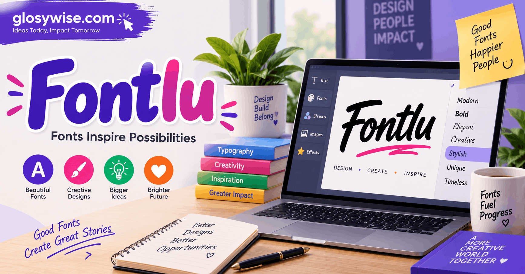
Fontlu – Type with Style
Introduction: Why Typography Still Matters in 2026
Every website, app, poster, and social media post you scroll past today is speaking to you twice — once through its words, and once through the shape of those words. That second, quieter language is typography. It is the reason a headline feels bold and trustworthy, or soft and playful, before a single word is even read consciously.
This is exactly the space Fontlu was built for. Fontlu is a typography platform designed to help creators — from solo bloggers to full design teams — find, test, and pair fonts with real confidence. Whether you’re branding a startup, designing a landing page, or simply trying to make a resume look sharper, Fontlu removes the guesswork from one of design’s most underestimated decisions: the font.
In this article, we’ll walk through what makes Fontlu useful, why font choice has such an outsized impact on how content performs, and how to actually use good typography principles in your own projects — drawing on real, hands-on design experience rather than just theory.
What Is Fontlu?
Fontlu is a tool built around one simple idea: choosing the right font shouldn’t require a design degree. It brings together font discovery, live pairing previews, and style-based recommendations in one place, so users can see exactly how a font will look in context before committing to it.
Unlike generic font libraries that simply list typefaces alphabetically, Fontlu organizes fonts by mood and use case — clean and corporate, warm and editorial, bold and modern, playful and casual. This mood-first approach mirrors how experienced designers actually think when they start a project: they don’t ask “which font is popular,” they ask “what feeling does this brand need to convey?”
That distinction is small on paper but massive in practice. A law firm’s website and a children’s toy store need completely different typographic personalities, even if both need to look “professional” in their own way. Fontlu’s structure nudges users toward that kind of intentional thinking from the very first click.
The Real Cost of Poor Font Choices
Most people underestimate how much a font can silently damage — or elevate — a brand. Consider a few real-world patterns designers see again and again:
- Readability loss. Decorative or overly thin fonts might look elegant in a mockup but become nearly unreadable on a phone screen at 14px.
- Mismatched tone. A playful, rounded font on a financial services site can unconsciously reduce a visitor’s trust, even if they can’t articulate why.
- Inconsistent pairing. Mixing two fonts that fight for attention — both bold, both decorative — creates visual noise instead of hierarchy.
- Poor accessibility. Low-contrast, overly stylized type excludes users with visual impairments and hurts overall usability scores.
Fontlu was designed with these pain points directly in mind. Its preview tools let users test fonts in realistic contexts — buttons, paragraphs, headlines — rather than isolated single words, which is where most font-selection mistakes actually happen.
Core Features That Set Fontlu Apart
1. Contextual Preview Engine
Instead of showing a font in a vacuum, Fontlu renders it inside realistic UI blocks: a hero header, a product card, a blog paragraph. This lets users judge legibility and personality the way a real visitor would experience it, not just as a floating sample word.
2. Smart Pairing Suggestions
Good typography almost always uses two fonts working together — one for headings, one for body text. Fontlu’s pairing engine suggests complementary combinations based on contrast in weight, width, and style, saving hours of manual trial and error.
3. Mood-Based Filtering
Rather than scrolling through hundreds of fonts, users filter by feeling: minimal, luxury, tech, handcrafted, editorial, bold. This mirrors how brand strategists actually brief designers, making Fontlu intuitive even for non-designers.
4. Performance-Aware Recommendations
Web fonts affect page load speed, which affects SEO and user experience. Fontlu highlights lightweight, web-optimized font options alongside heavier display fonts, so users can make informed trade-offs rather than accidentally slowing down their site.
5. Accessibility Checks
Fontlu flags potential contrast and readability issues directly in the preview, helping teams catch accessibility problems before launch rather than after user complaints or compliance audits.
How to Choose the Right Font: A Practical Framework
Drawing on standard practice used by working designers, here’s a simple framework you can apply — whether or not you use Fontlu specifically.
Step 1: Define the Brand Personality First
Before opening any font tool, write down three adjectives that describe how the brand or content should feel. Confident and modern? Warm and approachable? Serious and established? This list becomes your filter for every font decision that follows.
Step 2: Separate Headline Fonts from Body Fonts
Headlines can carry more personality because they’re short and large. Body text needs to disappear into pure readability — the reader shouldn’t notice the font at all when they’re three paragraphs deep into an article. A common, reliable pairing is a distinctive display font for headlines with a clean, neutral sans-serif or serif for body copy.
Step 3: Test at Real Sizes, Not Just Large Previews
A font that looks stunning at 60px can become cramped or awkward at 14–16px, which is the size most body text actually renders at. Always preview fonts at the sizes they’ll actually be used, across both desktop and mobile.
Step 4: Check Contrast and Weight Variety
Good typefaces usually come with multiple weights (light, regular, medium, bold) and sometimes italics. Having this range available lets you build hierarchy — headings, subheadings, captions — using one font family instead of mixing several, which keeps designs cohesive.
Step 5: Limit Yourself to Two Font Families
It’s tempting to use a different font for every section, but professional designs almost always restrict themselves to two typefaces maximum, occasionally supplemented by a monospace font for code or technical labels. Fewer fonts create more visual consistency and trust.
Step 6: Consider Load Time and Licensing
Web fonts add to page weight. Choosing a well-optimized font — or limiting the number of weights you load — keeps sites fast, which matters both for user experience and search engine rankings. Always confirm licensing terms too, especially for commercial projects.
Fontlu for Different Types of Users
Bloggers and content creators use Fontlu to make sure their articles are easy to read on mobile, since the majority of blog traffic today comes from phones. A well-chosen, highly legible body font can measurably reduce bounce rates.
Small business owners often don’t have a dedicated designer, so Fontlu’s mood-based filtering helps them land on a professional-looking pairing without needing design training.
Design teams and agencies use the platform to speed up the early exploration phase of branding projects, quickly narrowing hundreds of options down to a shortlist worth testing with clients.
Developers appreciate the performance-aware recommendations, since font loading strategy directly affects Core Web Vitals metrics like Largest Contentful Paint.
SEO and Typography: An Underrated Connection
Typography might seem purely aesthetic, but it has a real, measurable relationship with search performance:
- Page speed: Heavy font files slow down load times, which is a direct ranking factor for search engines.
- Dwell time: Readable, well-spaced typography keeps visitors on a page longer, signaling content quality to search algorithms.
- Mobile usability: Since mobile-first indexing is standard, fonts that render poorly on small screens can hurt both user experience and rankings.
- Accessibility compliance: Search engines increasingly factor in accessibility signals, and legible, well-contrasted type supports this directly.
By combining thoughtful font choice with performance-conscious loading, tools like Fontlu indirectly support stronger SEO outcomes — not by manipulating algorithms, but by genuinely improving the experience real visitors have on a page.
Common Typography Mistakes to Avoid
- Using too many fonts. Stick to two, occasionally three including a monospace variant.
- Ignoring line height. Cramped line spacing makes even a good font hard to read; aim for 1.4–1.7 line height for body text.
- Overusing bold and italics. Emphasis loses meaning when it’s everywhere; reserve it for truly important text.
- Choosing trendy over timeless. Highly stylized fonts date quickly; a strong, simple typeface tends to age better across years of brand use.
- Skipping mobile testing. Always check how a font renders on an actual small screen before finalizing a decision.
Frequently Asked Questions
Is Fontlu suitable for beginners with no design background? Yes. Its mood-based filtering and contextual previews are specifically designed to make font selection intuitive for people without formal design training.
Can Fontlu help with website performance, not just aesthetics? Yes, its performance-aware recommendations highlight web-optimized fonts, helping users avoid unnecessarily heavy font files that slow down page load times.
How many fonts should a single project use? As a general rule, two font families are enough for most projects — one for headings and one for body text — occasionally supplemented by a monospace font for technical content.
Does font choice really affect SEO? Indirectly, yes. Fonts influence page speed, readability, and mobile usability, all of which contribute to how search engines and real users evaluate a page’s quality.
Conclusion
Typography is one of those design decisions that’s easy to overlook and expensive to get wrong. A thoughtfully chosen font builds trust, improves readability, and quietly reinforces a brand’s personality — while a poor choice can undercut even the best content and design work around it.
Fontlu exists to make this decision easier, faster, and more informed, whether you’re a solo blogger polishing your first post or a design team building a full brand system. By combining contextual previews, smart pairing, mood-based discovery, and performance awareness, it turns “type with style” from a slogan into something genuinely achievable for anyone.
Good typography doesn’t need to be complicated — it just needs the right tool, and a little intentionality behind every choice.